
Plan Markup: 2 bed/2 bath, But Better!

This week marks the one year anniversary of Building Knowledge!
That’s nearly 90 posts, all with a 60% average open rate. I’m delighted to continue bringing y’all content, and today, it’s something special!
I put the call out on Twitter last week asking for volunteers to submit floorplans for me to markup. I got many, over email, DM, and posted on Twitter…and here’s the one I picked [at random] for a free markup!
Before we dive in, though, another couple of announcements.
Because you all are awesome, and I got so many submissions, I’m *probably* going to pick one or two more to markup this week…so stay tuned, yours might still get picked!
I’m going to do some more fun stuff/offers in further newsletters this week, so stay tuned…
And of course, now would be a great time to subscribe, if you’re not already - your support is vital to continue bringing this work!
And finally, I do this kind of consulting all the time, live, with folks right on Zoom. We mark up your floorplan together! I have sessions for homeowners and developers, and you can book/learn more here.
Ok, let’s dive in.
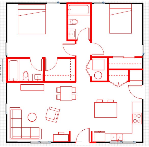
First, which one did I pick?
This 2 bed/2 bath, on one floor, was the lucky winner!
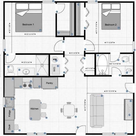
Let’s take a look at some of the issues.
The entry right into the living room isn’t ideal - even in a small house it’s nice to have just a bit of transition from inside to outside.
The bathroom door off the living room…not good. I see what they were trying to do - give both ensuite and “public” access to that bathroom - but there’s a better way!
Some of the bathroom dimensions are funky. A standard bathroom can be 5’x8’, if you’re not dealing with formal accessibility requirements. In a small space, don’t give over extra space to bathrooms when you could use it elsewhere!
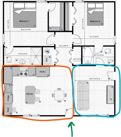
The location of what I think is the front door [green arrow below] splits the house into a smaller side [blue] and a larger side [orange]. Generally, you’d want the larger living space on the larger side - here, the living room is crammed on the smaller side, while the kitchen [which could be tighter] is taking up the larger side. We’ll try something different!

The doors are off. While the openings are the correct width, the actual door itself is drawn too short, giving false information about what kinds of doors fit in certain spaces. The primary bath door, for example, was drawn at about 26” [28” is needed for code, 30” is comfortable and is what is shown below]. The door into the primary bedroom had the right opening size, but didn’t have the right size door - it’ll stick further into the room than what’s shown. And same with the closet door - if we put a real door in, it’ll hit the clothes that are hanging on the rod.
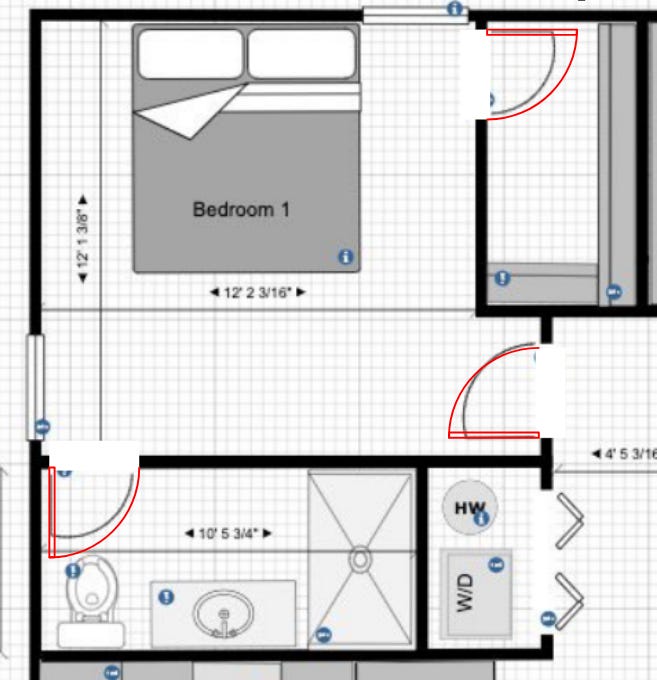
Speaking of closet rods, the “walk in” isn’t a real walk in. Remember, that line shown in the closet is where the rod is, so it marks the *middle* of where clothes are hanging. You need 24” clear for clothes to hang.
The primary bath is weirdly laid out - never open the door into the toilet, if you can’t help it!
The kitchen is pretty rough. I’m not sure anyone would want to sit at a desk cramped between the fridge and the sink, the sink is too small, the fridge is in the middle of everything, there is no room for a dishwasher, and the pantry is taking up too much space. We can do better!

Let’s talk about some things that are working well.
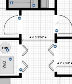
The plan uses one of my favorite tricks - the “bedroom/bathroom vestibule.” This hallway area can be packed chock-full of doors and closets, and not interfere with the living area - that’s great! However, here, it’s larger than it needs to be, and the location of the coat closet precludes hallway access to the bathroom.
It’s got a sensible structural grid - you can imagine how wood framing would work neatly in this space, and things line up [more or less].
The overall diagram is good - all living spaces ganged together, and all bedrooms together, buffered by bathrooms/closets between living and sleeping. We should try to keep that!

And now, for the “givens” - the things I didn’t mess with and the things I assumed.
That this is new construction, and we’re in the design phase. Nothing has been built yet, and we have free rein to make changes now.
That said, I kept all exterior windows and the overall exterior wall dimensions as-is. I tweaked the locations of the exterior doors.
I’m assuming it’s first floor, and on a slab or crawl space.
I’m assuming it’s in the US.
I’m assuming this is a single family, and has no FHA/ADA or similar requirements, and is under IRC. That said, this is not a fully vetted plan, and should *not* be used for application for building permit, pricing, or construction. It needs to be vetted by a local professional with proper license and credentials. This plan does NOT represent architectural services, and is just a sketch.
Oh, and - I’m sure with more time I could come up with many more options…this represents about 90 minutes of concentrated work. Longer, and I’d find more/better ways to do stuff!
Ok….ready for the fix?? Here it is:
I flipped the kitchen and the living space, giving the larger area to the living space. The side door entering into the kitchen makes more sense, anyway.
I put in two “wing walls” at the entry, which gives a bit of separation. It also allows for the kitchen cabinetry to terminate neatly, and gives a nook for the desk [which I moved out of the kitchen].
The kitchen is a bit bigger, and includes a pantry by the side door [or, this could be a bench and hooks, as a spot for removing muddy boots].
The coat closet is by the side door, but still accessible from the front door.
The bathrooms have been regularized, as standard 5x8 bathrooms, which gave us a bit more room in the primary bedroom, and allowed larger closets for each one.
The primary bedroom easily fits a king bed, while the secondary is showing a queen.
The “vestibule” concept is still being used, but it’s tightened up, to give that space to other uses.
The washer/dryer is flipped to the other side of the hallway, which gives more space to the primary closet, and still keeps it out of sight of the main living space [while still being easy to access].
If I had a bit more control over things like where the windows are located, and what the overall dimensions are, we could make even more moves. And of course, if I were working directly with the owner, I could hone things even more!
As it stands, what I’ve got here, after about 90 minutes’ worth of work, is better than what was there…and that’s what matters.
Good design is extremely powerful, and getting the right set of eyes on your project at the right time can save TONS of money and effort. I do this kind of consulting all the time [check out my special consulting page, for both homeowners and developers], but whether you work with me or not, what matters is that you work with true pros who can help you get every last inch of awesomeness out of your project!
So….what do *you* think? How did I do? What would you do differently?
Thank you for your support! Normally a post of this length would be a paid post, so if you’re not a paid subscriber, you’re getting a sneak peek of what the weekly longform posts are like!
I hope you’ll consider subscribing…it really does make a difference.
Thanks again, and as always - consult with your local pros, and make sure you’re following the rules of your local jurisdiction!