
15 Lessons: Choosing Paint Colors

One of the things I hear most often? People are terrified of selecting paint! It can feel very overwhelming for lots of reasons:
paint has a huge impact on the feel of a space
colors can be polarizing - landlords/business owners/homeowners don’t want to create a space that tenants/customers/friends and family will hate!
folks are worried about “resale,” or what others think, or that they will choose wrong, or that it won’t “go” with their furniture/decor
it’s expensive to paint a whole building, even if it’s just the interior or the exterior or even just a few rooms
folks are paralyzed by infinite choice
So…this is why a lot of buildings get painted white, beige, or gray. There’s nothing wrong with that - these are great colors to use, and there’s a reason they’re called “neutral.”
And while I’m often encouraging folks to explore beyond the white-gray-beige palette, I also understand the power and usefulness of those colors. It’s *ok* to use neutrals!
And…it might be fun to spice things up in a few places, too.
This post, however, is less about which colors you *should* pick, but more about how to make sure you’re making good decisions. There are many rules of thumb and best practices I’ve learned over the past two decades…here are 15 of my favorites:
Do paint samples in multiple rooms, and go look at them at different times of day and in different weather. They’ll look wildly different.
If the surface you’re painting is vertical, look at the paint sample vertically. Colors and paint sheen look very different when light hits them from above vs from the side.
Overwhelmed by choice? Here’s my quick method for getting close to the color you want:
hold a paint fan deck in your hand, with all the color cards fanned out
take whatever chunks of colors you *don’t* want, and slide them back into the deck
You’ll easily eliminate 3/4 of the colors with this move. Then, you can start thinking about more nuanced things, like what other materials are in the room, etc.
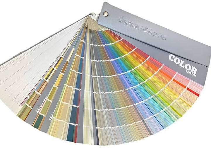
Sherwin Wiliams fan deck - so many options!
Always properly prep the paint sample area with primer, and apply two coats. If you slap a thin coat of a light color over top of existing dark walls, you’ll get a color that’s nothing like the real thing, because the dark color is still showing through the light color. Take your time, so you can properly judge!
Don’t stack sample colors right next to each other on the wall, unless they’re meant to be read together. When the final paint goes up, you’re not going to be loooking at it in comparison to other similar colors, you’ll be looking at it on its own.
Use moveable samples - paint some 12x12 pieces of properly prepped [see #4] drywall or plywood, and move them around the building, so you can see them in different areas, and in different combinations.
For exterior paint, samples should be done on each side of the building, and on the cladding material, not on a piece of plywood. Lap siding, for example, has a heavy shadow - that impacts how you read the color.
Stick to one paint company for your colors, if possible. While paint can be matched by different companies, it usually isn’t a perfect match. If you’re using good paint - like Sherwin Williams or Benjamin Moore - you’ll be fine.
Don’t forget about sheen! My go-to sheens:
Walls: Eggshell or satin
Ceiling: flat
Trim, doors: semi-gloss
Cabinetry: satin
There are many other options, like high-gloss or laquer finish, etc which can be super cool in smaller doses. The above list is pretty standard, and takes into account installation, maintenance, and longevity.
Look at your paint samples with the lighting that will be present when the project is finished. This is tough…on new construction/renovations, the final lighting is one of the last things to go in, so you might have to get creative. Just don’t make your final decisions under the horrible glare of construction lighting!
Don’t feel pressured to make a decision instantly, but don’t dither…at some point, white is white is white…
Some colors that can be tricky in certain spaces:
Bathrooms: bold yellows, greens, oranges…these can make folks with lighter complexions look sickly, and can make makeup application tough for anyone. They’re great colors, but probably not for the main “getting ready” space!
Bathrooms: similarly, dark colors are tricky for the main getting ready spaces. But for a half bath? Go for it!
Bedrooms: generally, cooler or lower-energy colors are best for these spaces. Reds/oranges get you fired up, blues/greens calm you down!
Kitchens: dark colors can make it tough to see what you’re doing. We’ve done a few darker kitchens, and they look really cool, but you have to take a lot of extra care with the lighting!
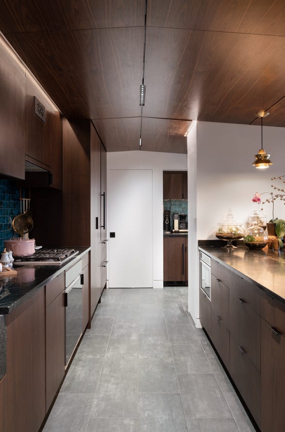
A dark kitchen, but - we brightened things up with strategic lighting and white walls. More on this project here.
Some colors people should use more often:
Dark neutrals: think super dark versions of purple, blue, charcoal, green, red…really anything! When they’re darker, they read more neutral
Almost-neon colors: think very bright spring green, electric royal blue, deep iris purple - these are colors found in nature, and used judiciously, can be fantastic in the right space!
Your favorite color: School bus yellow? Pepto Bismol pink? Chocolate lab brown? Fire engine red? Mountain sky blue? No one’s favorite color is white…find a place to interject your favorite somewhere!
Be on the lookout for inspiration…not just on Pinterest, but out in the world. Some places I’ve found cool colors I later used:
vintage matchbox
art museum
nail salon wall of polish
sports jersey
frogs
a flowering tree
sunset/weather
priest’s ceremonial robe
fish scales
baseball card
books on a bookshelf
rain puddles
people’s outfits
bakery
folk art
a salad
bottles lined up at a cocktail bar
eyes
bird feathers
a pile of laundry
makeup counter
label on a bag of chicken feed
and so on!
And remember - color is personal, and if you love it, that’s what matters! It’s not that hard to change [easier, say, than the tile or where walls go], so take a risk here and there. It can be changed!
Bonus: find someone whose style you admire, and get them to help you choose. Trust them. You see what they do, and you like it…now let them work their magic for you. If you’re going to choose white anyway, don’t bother…but if you’re ready to branch out a bit…ask someone to help you…and then *listen* to them!


So there you have it - some of my favorite techniques for choosing paint colors. I think I could easily come up with 15 more…maybe a future post!
What are some of yours? Where do you get your color inspiration, and how do you make choices about color?
As always, *thank you* for your support! It truly does make a difference in being able to bring you content consistently. If you’re so inclined, share with others!